CREATIVE DIRECTION
Helping grow a skincare brand through design
ROLE
Creative Designer
TIMEFRAME
Sept 23' to Present
Tools
Figma, Adobe Creative Suite, Blender
In these projects, I led the design efforts for Pavise, a skincare brand under B.A.I. Biosciences, focusing on direct-to-consumer (DTC), business-to-business (B2B), and packaging design. My role involved creating cohesive and visually appealing assets that communicated complex scientific information to modern consumers while ensuring a consistent brand presence across 600+ medical offices and innovative packaging for new product launches.
Milestones
Designed a successful 4-day BFCM campaign that led to 4.4X sales
Designed B2B promotional materials displayed in 600+ medical offices across the US
Creative direction led the B2B team to achieve month-over-month sales that increased, averaging 25%
Email campaigns designed delivered impressive results: an open rate of 65% and order rate of 16%.
To deliver effective designs, I conducted extensive research on consumer behavior, competitor strategies, and the needs of both Pavise’s audiences and product packaging. Understanding how to communicate skin science to both healthcare professionals and everyday users was crucial to developing targeted creative solutions.
Consumer Research
In the age of great questioning, reinventing people's relationships with brands means fostering authentic connections that resonate with their values and aspirations. With that, I tapped into the customer shift through continuous research of trends in skin care.
According to Dazed Media, new luxury consumers demand depth from the relationships they are forging with brands.
70% believe that a brand must have a POV to be influential today.
67% believe they must be sustainable and have strong ethics.
56% believe they need to have a purpose and live by it.
With this research, the cultural shifts are affecting who they buy, what they buy, and how they buy. Moreover, Gen Z is investing more in skincare than any other age group based on an L'Officiel article; however, their relationship with beauty and skincare brands is different from other generations. They tend to be motivated by confidence over appearance and surface representation.
70% say they like it when content from brands is not perfect. (YPulse)
Competitor Analysis
Alongside the following competitors: Supergoop, Neutrogena, SkinCeuticals, LaRoche-Posay, and EltaMD, we compared and identified the best practices for designing professional yet approachable assets that resonate with both consumers and medical professionals.
From this analysis, no one is playing the emotion and science marketing aspect compared to some competitors, which are either focused on emotion and culture, science and function, or function and culture.
Targeting Audience Needs
Collaborating with the internal marketing, sales, and product development teams, I ensured that the packaging not only reflected the brand's values but also gives the functional needs of consumers and the professional requirements of medical offices. Through constant collaboration with different teams, I was able to access data and gain insights for both consumers and healthcare professionals.
During implementation, I addressed the challenges of creating engaging content for DTC and B2B channels, as well as packaging that would resonate with both consumers and healthcare professionals. By using grid-based design systems, text hierarchy, and collaborative tools like Figma, I ensured that the brand’s message remained clear and consistent across digital platforms and physical displays.
Challenges
DTC
For social media, I needed to create a cohesive grid that stayed informational without appearing cluttered or overwhelming. For email campaigns, the challenge was organizing skincare education in a way that would be easily digestible for consumers.
B2B
For in-person events, including designing acrylic displays, banners, and a 3D-rendered trade show booth, I had to create materials that could be easily transported and set up while maintaining an elegant and professional appearance in different locations.
Packaging
Designing a packaging for Bioadaptive Stress Repair that balances luxury aesthetics, sustainability, and practicality.
Solutions
To tackle these challenges, I leveraged a minimalist design approach for DTC campaigns and used an authoritative, professional tone for B2B marketing materials. Here’s how I implemented the solutions:
DTC
Social Media Grids
I employed a strict grid system for social media posts, ensuring cohesion and balance. I use a grid system to maintain consistency across posts while presenting complex information simply.
Emails
I structured the emails with clear text hierarchy and ample spacing to make the educational content easy to scan and digest. I also used labels to summarize key concepts for quicker comprehension.
B2B
Event Materials and Booth Design
For in-person events, I designed elegant and easily transportable acrylic displays, banners and a modular 3D-rendered trade show booth that could be adapted to different locations. The 10x10m booth design was created with portability and sophistication in mind to ensure consistency across various medical offices.
Packaging
Created an identical packaging similar to Pavise's hero product, Dynamic Age Defense with a different color way for consistency. I ensured that the copy fits without compromising readability and meets FDA guidelines.
Balancing Complexity and Simplicity
One of my main learnings from these projects was how to take complex, scientific information and distill it into a format that consumers can easily understand without losing its credibility. I also learned the importance of maintaining visual consistency across diverse channels.
Using Grids for Consistency
Using grids became essential for maintaining a clean and cohesive visual presentation. This approach helped me achieve clarity and visual balance, especially when designing marketing campaigns.
Collaboration for Faster Turnaround
By implementing Figma as a collaborative tool, I was able to speed up the turnaround time for creative assets. This resulted to better communication across the team and made revisions easier.
Cross-Channel Adaptability
Designing for both consumers and healthcare professionals taught me the value of adaptability. The brand had to remain approachable to consumers while exuding professionalism for medical partners. This dual approach sharpened my skills in scaling designs for different use cases, from digital to physical media.
Thank you for reading! 👋
I appreciate you taking the time to read through my work with Pavise.
I hope you found valuable insights on my thought and work process.
If you'd like to discuss ideas, collaborate, or just simply connect, don't hesitate to reach out!
See more of my projects 👨🏼💻
PRODUCT DESIGN
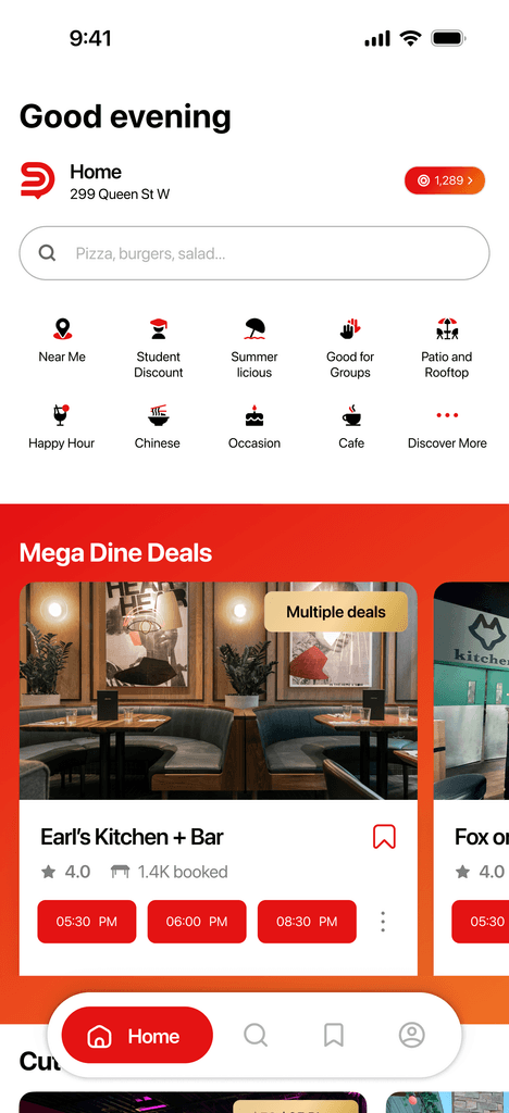
Building a worry-free dining reservation platform
Developed DineSmart's user-centric experience from concept to prototype.
UX DESIGN
Creating seamless digital experience to boost kids' camp registrations
Designed Vinewood Camp's user flow, shaped personas and organized the sitemap.
Brand identity
Shaping an identity for a sustainable digital solutions brand
Led the identity formation of a Toronto-based digital solutions startup with a focus in sustainability.


