BRAND IDENTITY
Newish
Shaping a fresh identity for a sustainable digital solutions brand
ROLE
Lead Designer
Timeline
4 weeks
TOOLS
Figma, Adobe Creative Suite, Miro
Newish is a startup digital solutions company based in Toronto, Canada, and a one-stop service helping SME clients build their websites, implementing marketing strategies in an interactive approach with a focus on sustainability.
When we were brainstorming for the identity for this brand, we wanted something fresh. In the ever-evolving and trend-run world, people always seek for new experiences. So, we got the term "new", as it represented our fresh ideas when experimenting with creative and intuitive strategies. The team also advocated for efficient and sustainable solutions that would flourish.
New creative ideas that would allow our clients to flourish with meaningful experiences. That's how Newish was born.
Initial Concepts
Logo
Aside from creativity, having good communication skills was an asset to the initial concept. In the first ideation phase of logo creation, I was able to lead the team in brainstorming. Aligning with our mission and vision, we asked ourselves the questions:
What element would best represent the brand?
What logo could be flexible in brand application across different channels?
Will the logo be legible enough for users to understand what the logo portrays?
Color Palette
Colors were crucial to our branding. We initially wanted "new, fresh, and trendy" to show in the palette we've chosen. And for the cherry on top, we wanted to ensure it was accessible and inclusive. What did that entail?
High Contrast Score = High Accessibility Score
We decided on a color way that was inspired by sustainability and modern mission. The palette you see on the right most part represents vibrance, freshness, and fun. That's it — this was our brand.
Font
Selection Process
The next challenge was choosing the typography. Below are just some of the questions we ideated on:
Do we want our brand to come across as quirky, modern, or simple?
Who is our target audience, and what could be their preferences?
How important is readability on different platforms?
How will our font represent our tone?
By having a discussion with the team, our decision guided the conversation towards using sans serif fonts, which emphasizes readability. Sans serif fonts portray modernity, simplicity, and clarity.
Moreover, we want our audience to value accessibility and readability, and the fonts were perfect for digital interfaces. We also considered the application in different channels and steered towards a practical choice as it reads better on screens.
Logotype
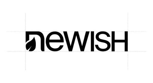
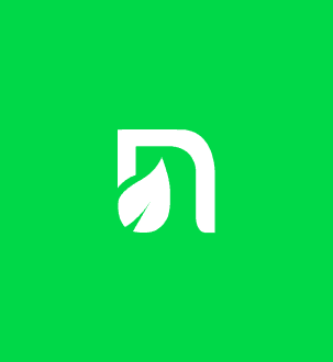
The Newish logo is functional and precise. Its name seeks to nourish ambitious entrepreneurs, and the leaf represents our advocacy for sustainability.
The core of Newish's identity consists of our primary logotype and secondary icon with leaf. These assets exist independent of each other and are never locked-up.
The understated and elegant logotype is our primary brand mark. The unique detail in the “n” is a symbol of our shared goal to push for sustainability and reflects our mission and values; as a graphic detail (not a diacritic), we use the spelling “Newish” when typing the brand name in context.
Icon
The Newish icon is our versatile secondary mark that represents our offering. This icon will be used for small branded moments where the primary logotype has already been introduced.
Icon
The newish icon represents the new ideas and strategies, alongside the prominent use of a leaf, which represents the life that we will bring to SMEs. The leaf also symbolizes that, as a company, we are advocates for sustainability.
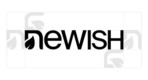
Exclusion Zone
The space around our logotype is equal to the width of the initial “n”.
Brand Elements
Typeface
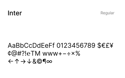
The Newish type system is built around Inter. Inter is a common app designed for a wide range of applications, from UIs to marketing and print. The Interface typeface family can cover over 147 languages and 2000 glyphs, which weights range from 100 to 900.
Choosing Inter
Inter features a tall x-height to aid in readability of mixed-case and lower-case text. Several OpenType features are provided in this font, like contextual alternates that adjust punctuation depending on the shape of surrounding glyphs, slashed zero for when you need to disambiguate "0" from "o," tabular numbers, etc.
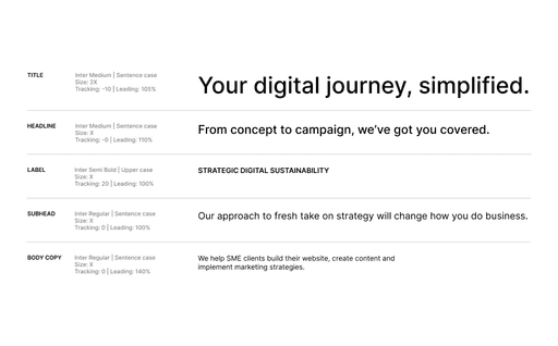
Type System
We use the headline type size (x) as a benchmark to scale our type system and create a clear hierarchy.
Color
The Newish’s color is inspired by sustainability and modern mission. The colors represent vibrance, freshness, and fun. These colors are not only expressive, but also accessible.
Brand Application
Newish in Action
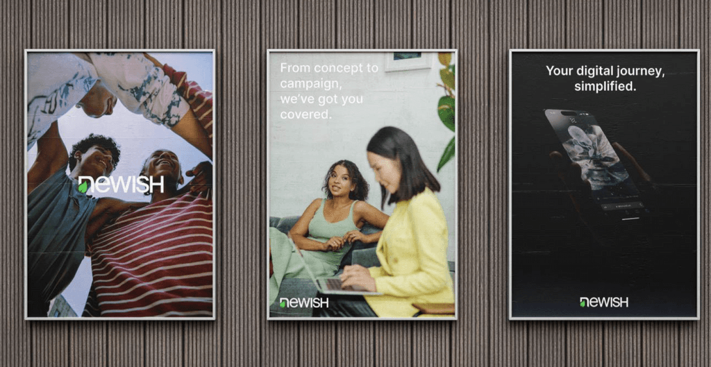
The Newish logotype can be used in any way, such as left-aligned, center aligned, right-aligned or around the edges depending on the application.
In brand awareness or expressive moments, the logotype is aligned centrally to image and copy. In applications with functional copy, the logotype is left aligned. Type and logo are anchored to the top and bottom margins.
Takeaways
Learnings
Inclusive Design is Important
While working with this project, I realized that design and creativity are a given. But, designs should also be accessible—from colors to font, down to the application of elements together. Moreover, it should also work in different applications, whether in print or digital.
Be Consistent in Visual Language
From choosing color palettes that reflect our consciousness with the environment (use of earth tones, leaf, etc.) to selecting modern, readable sans serif fonts—this brand identity needed to be consistent in representing sustainability and digital innovation. Making it consistent across digital platforms and through our marketing materials would improve brand recognition.
Balancing Creativity with Strategy
This identity was a great learning experience in identifying what resonates with the SMEs and tailor-fitting the branding to be approachable yet professional, and this helped Newish appear trustworthy. By learning how to balance creativity with strategy, every element—from the name to the design—resonates with the brand's core values and mission.
Thank you for reading! 👋
I appreciate you taking the time to read through my work on the brand identity for Newish.
I hope you found valuable insights on my thought and work process.
If you'd like to discuss ideas, collaborate, or just simply connect, don't hesitate to reach out!
See more of my projects 👨🏼💻
CREATIVE DIRECTION
Helping grow a skincare brand startup through design
Led creative efforts for Pavise's DTC and B2B channels.
PRODUCT DESIGN
Building a worry-free dining reservation platform
Developed DineSmart's user-centric experience from concept to prototype.
UX DESIGN
Creating seamless digital experience to boost kids' camp registrations
Designed Vinewood Camp's user flow, shaped personas and organized the sitemap.
